Dark Autumn lookbook
Dark Autumn outfit color examples
See how three Dark Autumn outfit combinations use the report's neutral warm, deep, and medium high color balance. Exact color names and hex values come from the validated Dark Autumn report.
Dark Autumn is the deepest Autumn, sitting at the border with Dark Winter. It keeps Autumn warmth and earthiness, but depth and contrast are stronger than True Autumn. The palette uses espresso, blackened brown, deep olive, tobacco, burnished copper, brick, oxblood, peacock teal, and antique gold tones. Colors should feel saturated by shadow rather than brightened by ice, so the best accents are rich and dense. The practical shopping goal is to choose deep warm colors with enough intensity to hold contrast while avoiding colors that are pale, powdery, neon, or cool-blue dominant.
- Undertone
- Neutral Warm
- Depth
- Deep
- Chroma
- Medium High
- Contrast
- Medium To High
Coloring in context
See Dark Autumn coloring in context
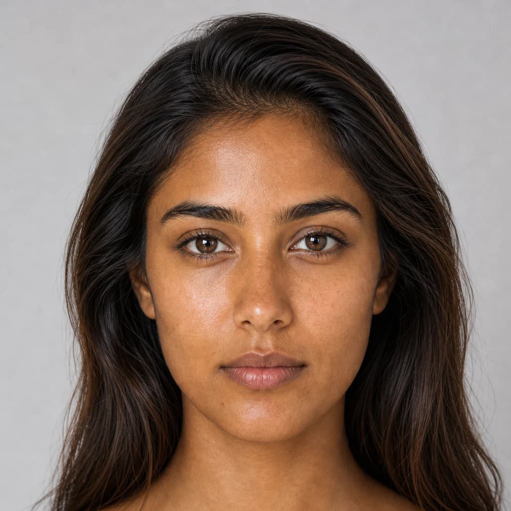
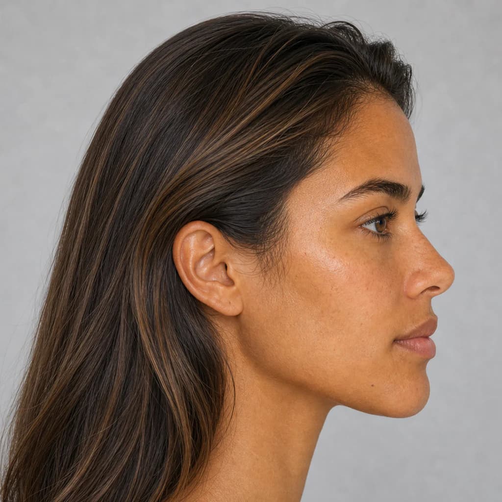
These front and profile portraits show the season's neutral warm undertone, deep depth, and medium to high contrast from two angles. Use that balance to picture how the report's colors could work with your own coloring.
Three practical combinations
Three Dark Autumn outfit combinations
Each look preserves the report's exact color names, hex values, uses, and reasons, so you can recreate the color balance with pieces you already own or shop for next.
Look 1
Espresso Copper
Best for evening and formal
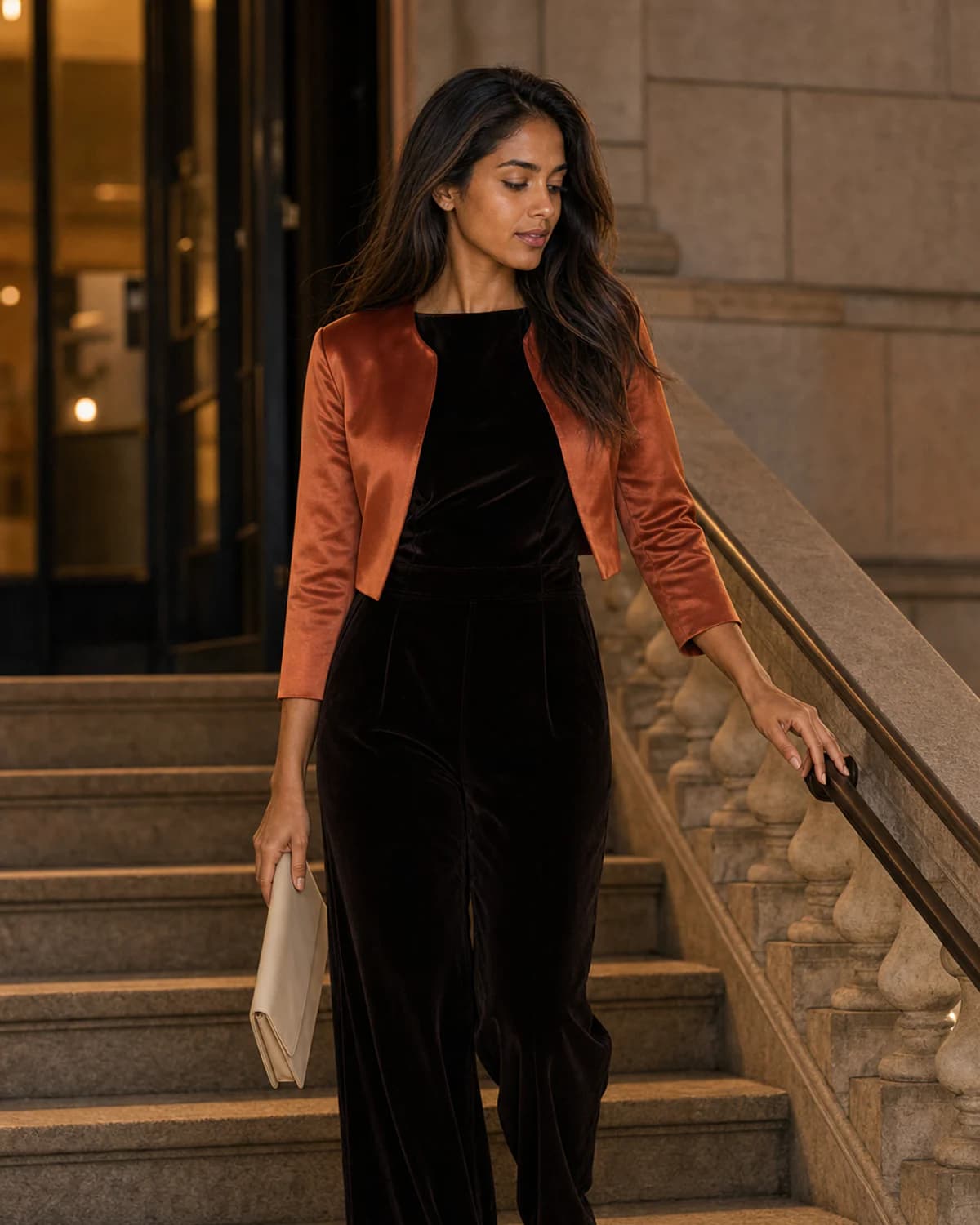
Espresso Copper uses Espresso Black, Burnt Copper, and Warm Bone for evening and formal. Build this combination from the exact report colors below. The swatches, names, and hex values are the palette reference; photography is visual inspiration.
- Espresso Black#1A120F
Use as an anchor for trousers, denim, coats, shoes, bags, and evening pieces.
It creates useful depth without pushing past the season's best contrast level.
- Burnt Copper#A94824
Use for tops, dresses, scarves, statement layers, or controlled color accents.
It adds color while staying aligned with the season's neutral-warm, deep, richly muted balance.
- Warm Bone#E4D5B5
Use for base pieces, tailoring, knitwear, shoes, and bags.
It supports Dark Autumn's neutral-warm, deep, richly muted balance without overpowering the wearer.
Look 2
Olive Depth
Best for professional casual
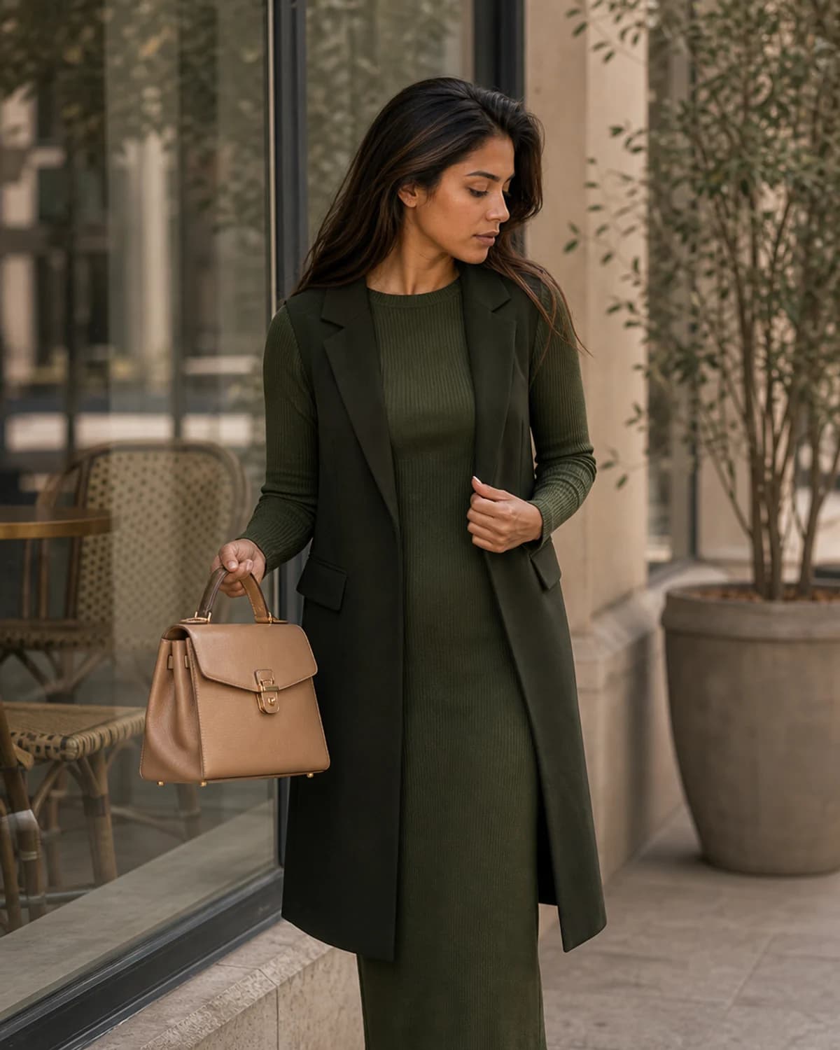
Olive Depth uses Black Olive, Deep Olive, and Camel Mist for professional casual. Build this combination from the exact report colors below. The swatches, names, and hex values are the palette reference; photography is visual inspiration.
- Black Olive#202813
Use as an anchor for trousers, denim, coats, shoes, bags, and evening pieces.
It creates useful depth without pushing past the season's best contrast level.
- Deep Olive#4D5E2D
Use for tops, dresses, scarves, statement layers, or controlled color accents.
It adds color while staying aligned with the season's neutral-warm, deep, richly muted balance.
- Camel Mist#D3B58C
Use for shirts, lightweight layers, summer pieces, and soft contrast near the face.
It keeps the look lifted and wearable while respecting the season's temperature and chroma.
Look 3
Peacock Brick
Best for work and events
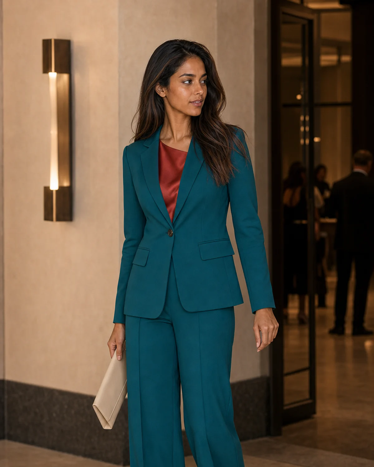
Peacock Brick uses Peacock Teal, Brick Red, and Warm Ivory for work and events. Build this combination from the exact report colors below. The swatches, names, and hex values are the palette reference; photography is visual inspiration.
- Peacock Teal#006A67
Use for tops, dresses, scarves, statement layers, or controlled color accents.
It adds color while staying aligned with the season's neutral-warm, deep, richly muted balance.
- Brick Red#8B2F27
Use for tops, dresses, scarves, statement layers, or controlled color accents.
It adds color while staying aligned with the season's neutral-warm, deep, richly muted balance.
- Warm Ivory#EFE2C6
Use for shirts, lightweight layers, summer pieces, and soft contrast near the face.
It keeps the look lifted and wearable while respecting the season's temperature and chroma.
Your colors, made personal
Could these be your colors?
A personalized color-season report identifies the palette most likely to complement your natural coloring, then turns it into practical guidance for getting dressed, shopping, and choosing accessories.
- Your color season and defining traits
- Exact named colors and hex values
- Outfit, makeup, jewelry, and shopping guidance
Start with one clear photo and discover the colors that look at home on you.