Bright Spring lookbook
Bright Spring outfit color examples
See how three Bright Spring outfit combinations use the report's neutral warm, light to medium, and high color balance. Exact color names and hex values come from the validated Bright Spring report.
Bright Spring is the clearest and most vivid Spring, sitting at the border with Bright Winter. It keeps Spring warmth, but brightness is the dominant trait: colors should look clean, electric, and freshly lit. This season can handle stronger contrast than other Springs, especially when blackened anchors are replaced by ink teal, clear navy, espresso, or another crisp dark. The best palette includes hot coral, clear red, acid yellow, bright turquoise, emerald, and sharp warm pinks. The practical shopping test is whether a color looks vivid and clean without turning icy, dusty, or browned.
- Undertone
- Neutral Warm
- Depth
- Light To Medium
- Chroma
- High
- Contrast
- Medium To High
Coloring in context
See Bright Spring coloring in context
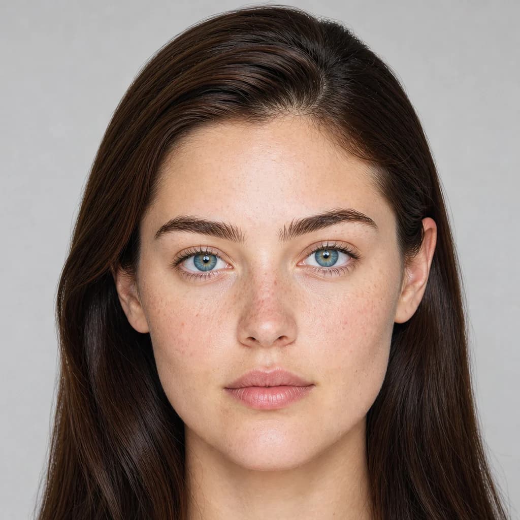
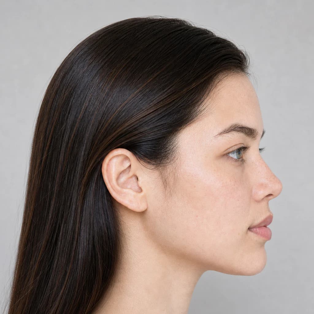
These front and profile portraits show the season's neutral warm undertone, light to medium depth, and medium to high contrast from two angles. Use that balance to picture how the report's colors could work with your own coloring.
Three practical combinations
Three Bright Spring outfit combinations
Each look preserves the report's exact color names, hex values, uses, and reasons, so you can recreate the color balance with pieces you already own or shop for next.
Look 1
Electric Coral Neutral
Best for statement workwear
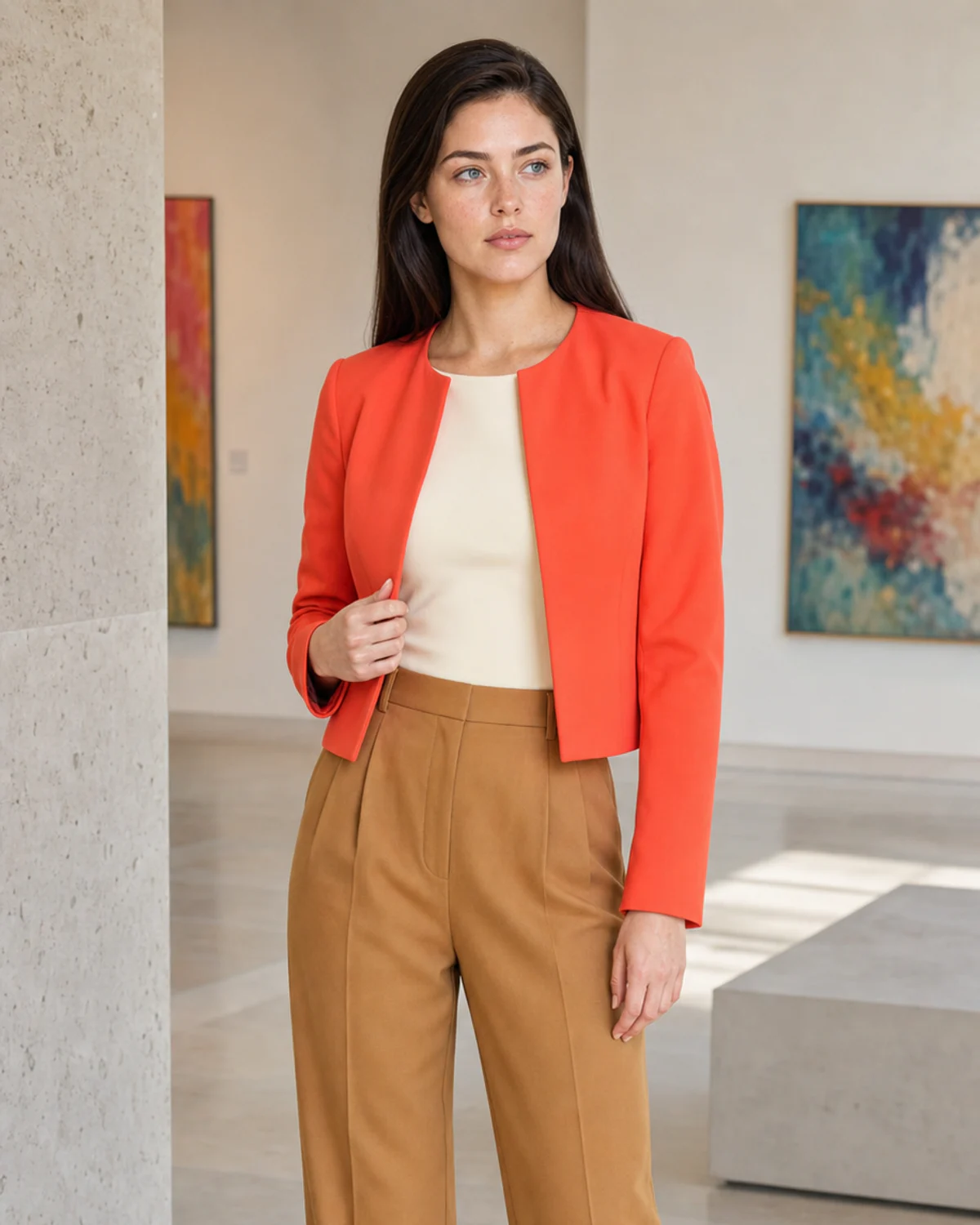
Electric Coral Neutral uses Clean Ivory, Electric Coral, and Clear Camel for statement workwear. Build this combination from the exact report colors below. The swatches, names, and hex values are the palette reference; photography is visual inspiration.
- Clean Ivory#FFF3D9
Use for base pieces, tailoring, knitwear, shoes, and bags.
It supports Bright Spring's neutral-warm, high-chroma, high-contrast balance without overpowering the wearer.
- Electric Coral#FF4F42
Use for tops, dresses, scarves, statement layers, or controlled color accents.
It adds color while staying aligned with the season's neutral-warm, high-chroma, high-contrast balance.
- Clear Camel#C58E42
Use for base pieces, tailoring, knitwear, shoes, and bags.
It supports Bright Spring's neutral-warm, high-chroma, high-contrast balance without overpowering the wearer.
Look 2
Bright Aqua Contrast
Best for events and creative settings
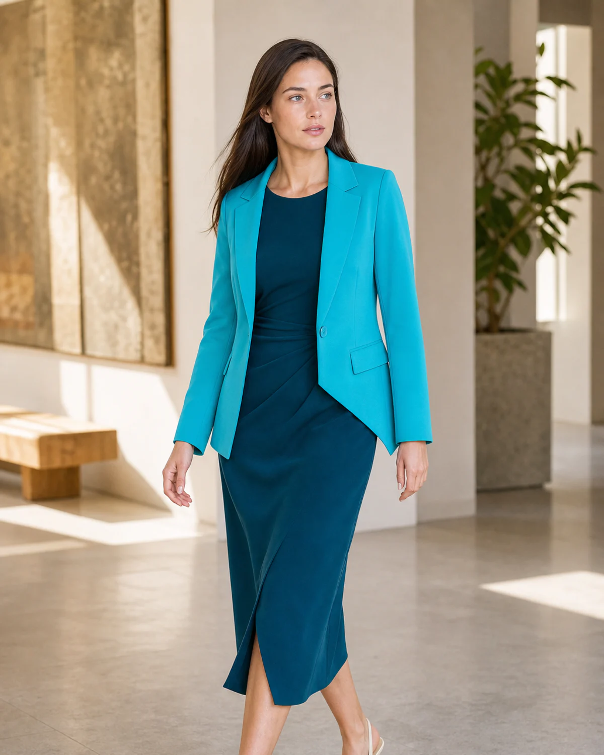
Bright Aqua Contrast uses Ink Teal, Bright Turquoise, and Warm White for events and creative settings. Build this combination from the exact report colors below. The swatches, names, and hex values are the palette reference; photography is visual inspiration.
- Ink Teal#005E6E
Use for base pieces, tailoring, knitwear, shoes, and bags.
It supports Bright Spring's neutral-warm, high-chroma, high-contrast balance without overpowering the wearer.
- Bright Turquoise#00BFD2
Use for tops, dresses, scarves, statement layers, or controlled color accents.
It adds color while staying aligned with the season's neutral-warm, high-chroma, high-contrast balance.
- Warm White#FFF7E5
Use for shirts, lightweight layers, summer pieces, and soft contrast near the face.
It keeps the look lifted and wearable while respecting the season's temperature and chroma.
Look 3
Citrus Pop
Best for weekend and vacation
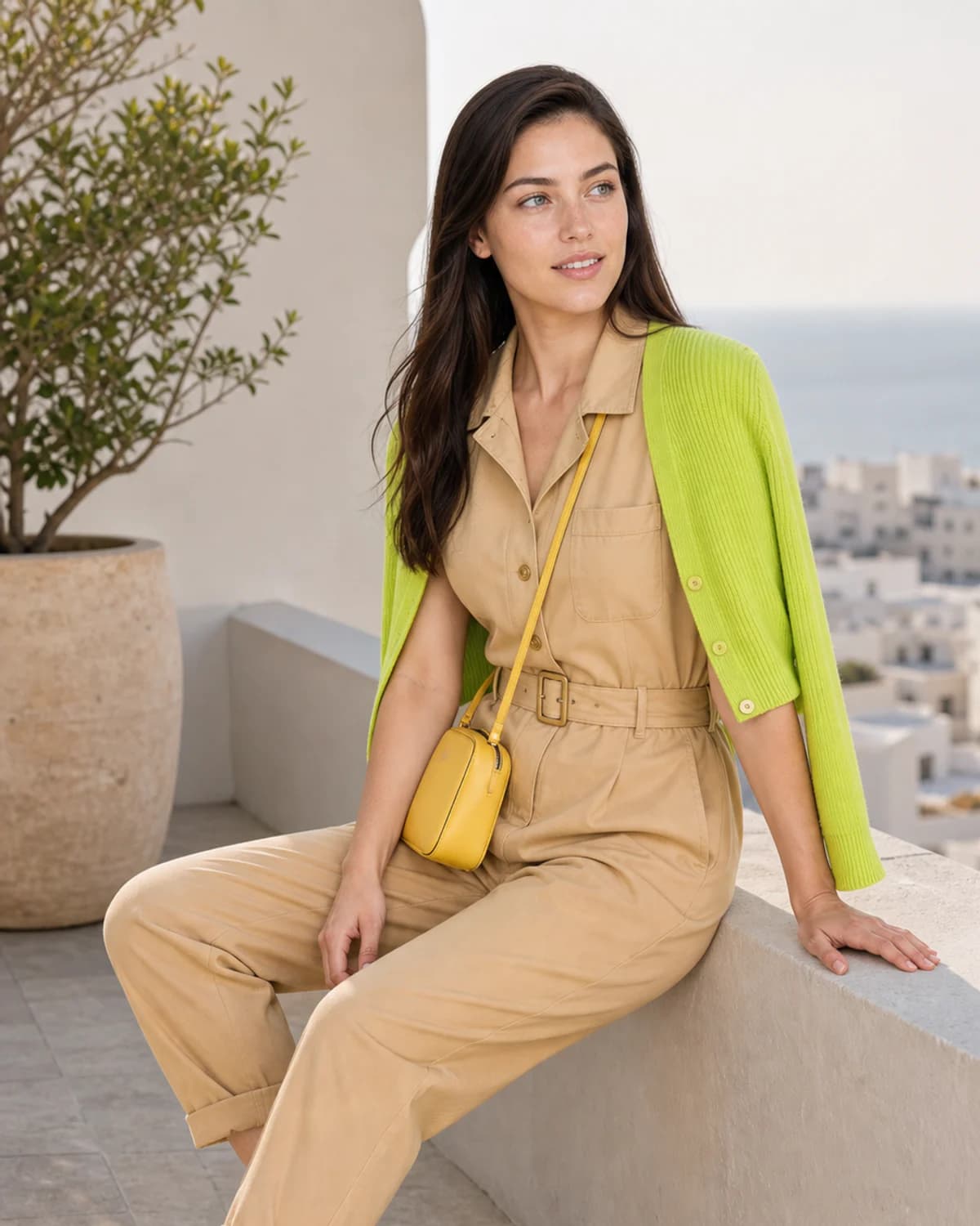
Citrus Pop uses Bright Sand, Acid Lime, and Sunny Yellow for weekend and vacation. Build this combination from the exact report colors below. The swatches, names, and hex values are the palette reference; photography is visual inspiration.
- Bright Sand#E9C179
Use for base pieces, tailoring, knitwear, shoes, and bags.
It supports Bright Spring's neutral-warm, high-chroma, high-contrast balance without overpowering the wearer.
- Acid Lime#B7E441
Use for tops, dresses, scarves, statement layers, or controlled color accents.
It adds color while staying aligned with the season's neutral-warm, high-chroma, high-contrast balance.
- Sunny Yellow#FFD83F
Use for tops, dresses, scarves, statement layers, or controlled color accents.
It adds color while staying aligned with the season's neutral-warm, high-chroma, high-contrast balance.
Your colors, made personal
Could these be your colors?
A personalized color-season report identifies the palette most likely to complement your natural coloring, then turns it into practical guidance for getting dressed, shopping, and choosing accessories.
- Your color season and defining traits
- Exact named colors and hex values
- Outfit, makeup, jewelry, and shopping guidance
Start with one clear photo and discover the colors that look at home on you.